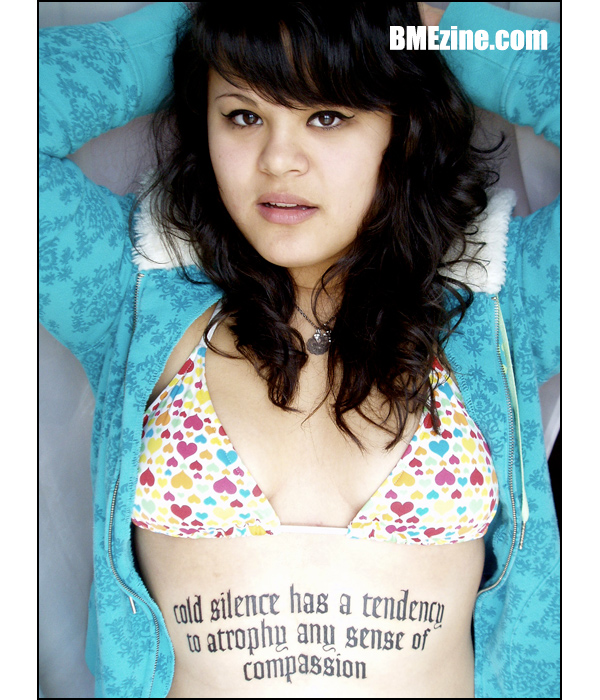
These lyrics from “Schism” by Tool were tattooed by Clay Willoughby at Body Graphics in Philadelphia, Pennsylvania. And just because you’re all so lovely, the video for the song in question can be found after the jump.
See more in “Lettering Tattoos“ (Tattoos)
 BME/News and Modblog highlight only a small fraction of what
For some reason… When I look at this… I think it looks fake =S
that looks pretty tight, im not gonna lie. and tool is the shit for real!
I agree with #1.
It looks like those hidden bmezine.com signs that are photoshopped into pictures.
At first, that’s what I thought it was.
😡
I love that song, it’s badass to play on guitar!
Thus, I like the tattoo.
i’m not a fan of letering tattoos but it looks really nice..and just because it is from tool it loks even nicer xD tool ftw!
i’m not a fan of lettering tattoos but it looks really nice..and just because it is from tool it loks even nicer xD tool ftw!
I dunno, I’m not really diggin on this one, the placement just seems very odd to me. It too looks fake when I look at it.
I does look fake to me, but the rest of the picture looks pretty fake too. Not a fan of the placement.
I agree with all of you, kind of odd placement and does look fake when you first look at it
(maybe that’s a good thing?)
I love Toll!
and also the tat is very tight!
The placement IS a bit odd, but it isn’t outright awkward, and I think that makes it really stand out.
I also love that song to bits.
Bad placement… bad font….
tool are amazing.
maybe it would have looked better on the side of her rib cage, but it’s still some nice lettering!
…when I turn 65 and retire Im gonna go back to listening to tool, they are so….wow! just so…..amazing! like…..the best band ever!
I love Tool! Not so crazy about the tattoo, though…
This picture is SO Photoshopped.
1. “tattoo” opacity. why toooooo much.
2. messing around the face with the clone stamp tool.
cool picture though.
why = way.
gay keys.
I agree this isnt a real tattoo. I love tool and with the way the song is sung I would place the lyrics different, and somewhere else.
Glorious, and what a cute face! Love it! <3
This tattoo IS real and it itches like hell. I know it looks fake and I’m sorry, but seriously, it’s not. Super duper promises, guies.
I’m not gonna say outright that it’s fake, but I’d like to see a less doctored photo.
I also agree it’s a strange tattoo.
And super duper thanks for posting my picture! When I saw this, my heart skipped several beats!
:D:D:D
I’ve seen this up close. It IS very real.
It wasn’t doctored at all.
-.-
I know for a fact that it is a real tattoo and I like it….
…and I’m also pretty sure that this photo is NOT photoshopped
My tatts all had a wierd opacity until a week after the ‘scab’ healed.
I like the tattoo, and it’s placement, unexpected and delightful, both it’s location and the person it’s on.
And Tool….much fun for a bassist like me!
You be lookin’ fiiiiiine!
And the tattoo is for sure, very real.
<3
That tattoo is undoubtedly real. I know it. And I think it looks gorgeous. And no photoshop, she just really is that hot
I’ve had my tattoo for a year and people still ask me if it’s real- some honestly believe I used a sharpie and drew it on.
Tool + Tattoo= Awesome/Love
seriously doesnt look real, high-res image available?
do any of you understand the concept of lighting in photographs? sometimes they make things appear slightly different than in real life? doesn’t mean it’s not fucking real. DUH.
I think it is lovely. The placement is nice, the lyrics are nice, the font is nice, and the person is nice. Good combo.
Chrissy, I love you to pieces. Come back to Philly NOW.
love it.
the placement IS odd for such a bold choice, I think, but that makes it all the better, IMO.
And a pretty girl, too 🙂
1. For everyone who claims “know” this is photoshopped: get over yourselves. you don’t know Natalie. but if you did, you would know IT’S A REAL TATTOO.
2. Natalie know she’s no fake. I’ve known her for 5 years now. She really is that fucking hot. DEAL.
3. AND just because the tattoo isn’t a choice that some of you would have made doesn’t mean its bad, it’s what she likes, and it’s on her, not you, so what do you care?
Bottom Line: Sick tattoo, awesome person, great fucking band. <3
i love it. though the font seems kinda bent since it goes over the solar plexus. i don’t really know what makes a tattoo look “fake”… but whatev. very bold. very cool.
http://tinyurl.com/cbehx6
Enjoy your high-res.
James, are we friends on Stickam? If not, then that’s a little weird…
XD
ok fuckers, i’ve seen it in person, it’s more real than the people who say it isn’t.
It’s gorgeous Nat, and i love the placement it’s not normal, I don’t like normal.
and photographer to photographer, this shot is beautiful.
love youuuuuuuuuuuu
this song always used to make me think of a moldy jigsaw puzzle.
in the prettiest way possible.
Not sure why..its just what went through my head…
Maybe the camera was too close, it looks fake but might be an effect caused by the flash. I don’t like the placement though, but can’t think of a better place to get it on either…
The word compassion looks kind of odd, but I looooove Tool, and it goes way beyond anything I may not like about it
Cheers!
Didn’t use a flash, it’s all natural light. I was standing in front of my window.
i bet she don’t even know what that means haha
I love the placement. Certainly beats having it written down the inside of your forearm (which seems the be the latest chav placement around here). The girl reminds me of Kate Nash.
I know the tattoo fits, b/c I saw the picture of it…
( sad attempt of a tool interpolation)
at any rate, I do like it alot. I think what sets it off is the placement. it’s a surprise to see that there, of all places. I mean , like smurf said, usually its’ an arm or back…
I think it creates a more intimate connotation.
in sum, I like.
It looks out of place to me 🙁
Is that the singer from Operator Please?
what’s so weird about the placement?
it’s like no one’s ever seen a tattoo there before…
http://news.bmezine.com/2008/09/09/then-were-all-blessed/#comments
and you seriously think it’s fake? even with it saying who tattooed her?
modblog conspiracy? and no one’s ever walked on the moon either, right?
No Natalie. We are no friends on Stickam.
Goddamnit. I don’t look like the singer of Operator Please.
-_-
How’d you find that, then?
I’m so lost.
It doesn’t matter.
Let’s talk some time. Catch up and stuff.
Alright, get in contact with me whenever you can…If you know how to get in contact with me…
OH, OH, OH! I’ll be at the Philly Tattoo Arts Convention in the afternoon! I’ll probably be there between 3 and 4 and I’m planning on wearing the hoodie I’m wearing in the photo if anyone wants to spot me and say hi!
😀
hahaha, sorry Natalie, but my first reaction to this pic was “holy shit, it’s the lead singer from Operator Please!”
D:<
I DON’T LOOK LIKE HER.
Sorry Natalie…i looked at a picture of her and you are much prettier than she is!
😛
Kinda creepy… that exact line was playing on my computer as I scrolled to the picture… weird!
The lettering looks nice too!
i like the tattoo but i’m not too keen on the actual font, it reminds me of the bad quality ‘picked off a wall’ stuff my brother has all over his body!
Are you still using AIM: you*********n?
Indeed, I am.
Just the head looks photoshopped onto the body and so does the lettering. It’s the composition of the photo and really i think the sweater you’re wearing. Just looks a little off. Not CRAZY about the font, but i love the words chosen.
Hahahaha, head photoshopped on body. Natalie does not have the skill to do such thing.
This is what she looks like, I’ve seen her in person. I can’t confirm the tattoo is real however.
-_-
Who are you to underestimate my Photoshop skill?
Either way, I didn’t even open this file in Photoshop. Came right off of my goddamn camera.
And here’s confirmation that the tattoo is read: http://tinyurl.com/d8hrfz
Ughh.
*real
Holy dumbass haters. People need to get a life instead of screaming ”chopped!’ at every pic that isn’t perfect. Its clear to me that its real, not photoshopped and the text is dead centre upper abdomen, in front of your diaphragm, which is why is looks uneven. There are ribs there. Sigh.
Don’t you mind them.
I don’t know you but I think your tattoo is sweet.
Great video, great song, and great tattoo. Today’s started off well for me.
Because I am a photoshop hero myself. And again, I know you.
And you haven’t IMed me so I can figure out who you are because…..?