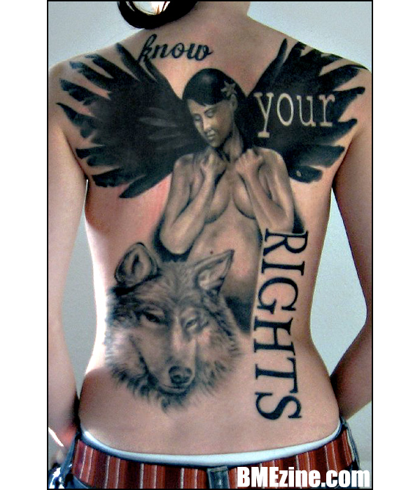
This isn’t a particularly provocative statement, but DrPhil‘s back-piece up there is one of the more original designs I’ve seen in a while. Not that something has to be unique to be great, of course, but there’s some stylistic stuff here you just don’t see very often, and I think it makes for an interesting piece. Also, any reference to The Clash, intentional or not, is a winner.
(Tattoo on DrPhil, by Basti at Morbus Gravis in Darmstadt, Germany.)
See more in “Fairies and Angels“ (Tattoos)
 BME/News and Modblog highlight only a small fraction of what
I like this a lot. Although I like it more because it is interesting to look at than the quality of work.
I am confused a bit, is it supposed to be an animal rights and religious rights statement or am I just thinking to hard?
Its decent, but modblog sucks now
this is absolutely beautiful… I’m very, VERY impressed.
…. MadHatter – I don’t understand WHY modblog sucks now… I think it’s still the same old modblog, just without a lot of the shocking and very explicit pictures; the community isn’t just about the more extreme remember 🙂
i don’t get it. i really don’t like this.
I don’t get it at all, but I LOVE this piece.
I do not like this at all. It’s just, kind of useless? Odd?
Not in a good way. I do like the where “Your” is and that it’s negative. Kinda neat I guess…
Ok I got animal right, religious rights, and woman’s body rights (abortion- right to choose). I think it’s a different way to get those points across. I love the wings btw!
Wow! I love this!
I agree modblog sucks
Jesus, I don’t understand why everyone has to put this down. To each their own.
You suck, Jordan!
pretty boobies on that tattoo
/agree with 2, 4, 6, 11
FUCK YOU, JORDAN
Candice, have you met Warborn? I think the two of you would get along miserably.
i dont get it either but like ive said before i dont mind seeing a range of stuff.
i do like the attempted use of graphic-y typography but im not sure if it works well with the images.
her hands are also slightly odd.
cud the wearer explain it for us? im curious.
Dear Jordan,
No matter what they say, know i will always love you.
Now, was this public service announcement with guitars???
People keep saying modblog sucks now, I fucking hate complainers.
So its not what YOU want anymore? Make your own fucking site dedicated to body modification. You hire people, choose content, dedicate hours to it.
Or just stop typing ‘modblog’ into google.
ungrateful assholes. God damn I hate everyone.
Thank you jordan, roo. For putting time into this. It’s not Shannons thing anymore and it is different so if you hate it so much stop coming back.
UUUUUGGGLLYYYY
Sometimes I just want to write “modblog sucks now!!11!” just to be part of the in crowd. If I comment to complain about how much BME sucks on every post, can I be popular, too? Pleeease?
Why is everyone hating on Jordan? I think he’s pretty great
um. megzors.
his predecessors were far superior in every way.
he is the most good-looking, actually. so… most ways, then.
YES!
SWEET VALIDATION! GLORIOUS VICTORY!
/has a serf bring him an oversized turkey leg and a golden chalice brimming with delicious libations
a golden chalice brimming with delicious libations?
Lets Get Krunked!
I wonder who it is that keeps posting as me and saying vitriolic lil statements with no backing? Everyone knows i make a statement and then give an example. C’mon now, you’d never pass an assignment making wild unsubstantiated statements 🙂
I agree… modblog is cool!!
I agree, modblog sucks now!
I agree with number 11.
this backpiece would be sooooo much nicer if the wolf would not be there!
such a mismatch muddle of tattoo(s)
Why do people want their tattoos to look like they put them together in photoshop?
I like the composition, the wings have so much depth and I love the revers type, but i’m not so keen on the font choice. Still, each to their own.
Am I missing an in-joke with the “modblog sucks” thing?
The rights to life, liberty, and the pursuit of growing wings so you can ride a [presumably] magical wolf into the sunset.
I got it straight away.
well, i like it. i’m surprised by how many people don’t.
I don’t see why people would put this tattoo down. it is extremely well done. The detail is wonderful, clearly a very skilled tattoo artist did this and it took a long time. Apparently people think that quickly done, marginally witty old-school style tattoos are way more brilliant than something that took at least 10 hours of skilled shading. And I’m not knocking old school tattoos, just saying that what people rave about on this site while dissing a piece like this makes almost no sense. maybe if instead of saying “rights” it said “boobs”? ? Anyway, I don’t think this looks like the different pieces of the tattoo were just stuck together randomly, and I don’t think we necessarily have to make the superficial assumption that the angel means religion and the wolf means animal rights… angels, women and wolves all have a shitload of metaphor associated with them. And “know your rights” is actually a pretty bold and provocative statement considering that our international rights are almost unenforceable and even national rights are violated constantly all over the world leaving people with little to no redress. The fact is that a large majority of people in on this planet don’t know their rights and aren’t even legally entitled to basic human rights we take for granted in the west. Rights are very powerful tools, human rights especially. If you know you can fight, and to know and advocate for your rights despite the endless intimidation and misinformation leads to murder and torture in so many places on this earth. So yeah, know your rights. props to this girl for getting this tattoo despite evey idiot who is going to tell her she copied angelina jolie’s shittily done tattoo.
eh
wont say much since i gotta text this… jordan: most of us love you & would defend U till the death 😉 (b) modblog is CLEARLY awsome since you idiots are still on here AND posting (c) im quite confident its a native american rights tattoo
fukin’ A praxis
Ballin ass belt.
It would be sweet if the girl herself would illuminate the meaning behind “know your rights”, and how it fits in with the rest of the tattoo.
The whole thing looks good, but I’m vexed as to how the disparate elements of the text wolf and angel are intended to be interpreted.
I like everything but the wolf (it just seems out of place to me). Stylistically, I love font choices and the placement of everything. It’s nicely balanced, and it’s great to see a different style of tattoo on here. I like the wings a lot, they’re reminding me of charcoal and inkblots.
in my book committing to anything on that grand of a scale deserves props. its not fun to have to sit that long, but its worth it when the end result is really something you and the artist can be proud of.
agreed on the looks comment. jordon is quite good looking!
plus i like your posts. find another blog if you don’t like this one!!
I like it… I think. But I’m not sure why. Individually, I like a lot of the components – I love the wings, and the ‘your’ in negative space. All the text, actually. I’m not a huge fan of the girl’s face, but apart from that I think it all looks well-done. I’m just not sure that the different elements fit together, or what it’s supposed to mean. Not that tattoos have to mean anything, but with a statement like ‘know your rights’ incorporated I would have expected it to be more coherent…
Unfortunately, tha image quality is that bad, that you don’t see any details of the tattoo, progressive noise is swallowind every fine art.
You can’t say from that pic, if the tattoo is extraordinary well done, rich of fine structures and details, and very smooth at bigger black parts.
You don’t see both. fine details are gone, and the quality of the blackwork is hidden behind the noise.
A pitty. Picture killed the mod. I think sufficiant image quality also should be a part of modblog…. ’cause: How could you discuss a work, when you don’t see it? A picture less, but exactly describing text might be more worth than that image.
Well done but the use of more than 2 fonts/lack of good blending kinda makes it look like it was pieced together by a 5 year old…
i really like this tattoo.
also, i’m always very impressed with how jordan and roo deal with all the insults thrown at them. Haters, please leave.
technically, i think this piece is done very well, graphicially, it’s very bold, and though it takes a bit to see the meaning, it means something to the wearer and is definately a statement. no, it isn’t anything i’d want on myself, but it’s far from being some bad scratcher ‘work’.
AND i should add that i was kinda looking forward to seeing a guitar in it. you suck jordan. thanks for getting my hopes and then smiling as they crash and burn….
I LOVE MODBLOG.
I really do!
so i’m not too crazy about this peice, more because i’m not crazy about the composition- fonts and placement,
can’t say i disagree with the message but i hope she wears a lot of backless shirts
I believe Dani in comment number 7 is right on. The wolf at the bottom represents animal rights, religious rights seeing as the woman has a set of wings, and woman rights for the fact that her nudeness portrays femininity. That’s all I could distinguish so far.
not down for this at all
Pi Pyo Pi has spoken!
I like it!!