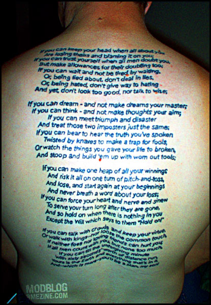
One of history’s great poems, tattooed as a backpiece by Cam von Cook at Osborne Village Ink in Winnipeg, Manitoba.
One of history’s great poems, tattooed as a backpiece by Cam von Cook at Osborne Village Ink in Winnipeg, Manitoba.
 BME/News and Modblog highlight only a small fraction of what BME has to offer. Take our free tour and subscribe to BME for access to over 3 million body modification related photos, videos, and stories.
I hate to be “that guy”, but there’s a typo on that bad boy. Breathe is spelled ‘breath’. Bummer.
Otherwise it is quite striking.
I hate to be “that guy”, but there’s a typo on that bad boy. Breathe is spelled ‘breath’. Bummer.
Otherwise it is quite striking.
There’s another typo.
“And yet, don’t look too good nor talk to(o) wise.”
Definitely nice though. The kerning is very even.
There’s another typo.
“And yet, don’t look too good nor talk to(o) wise.”
Definitely nice though. The kerning is very even.
i’m pretty sure that’s the right version of “too” there and at least the “breathe” could possibly be fixed.
i don’t know the poem but should it be ‘lose’ not ‘loose’ in the last paragraph?
i’m pretty sure that’s the right version of “too” there and at least the “breathe” could possibly be fixed.
i don’t know the poem but should it be ‘lose’ not ‘loose’ in the last paragraph?
the ‘too’ isn’t a typo, that’s the correct useage
the ‘too’ isn’t a typo, that’s the correct useage
I dunno dreaming4444. Googling the phrase as it is spelled in the tattoo finds 127 results, whereas searching for it spelled “nor talk too wise” (with two ‘o’s) finds 39,700. Seems like a typo to me.
Unless of course you’re joking, considering your spelling of “usage.”
I dunno dreaming4444. Googling the phrase as it is spelled in the tattoo finds 127 results, whereas searching for it spelled “nor talk too wise” (with two ‘o’s) finds 39,700. Seems like a typo to me.
Unless of course you’re joking, considering your spelling of “usage.”
Just wondering what the life of a tattoo as fine as this would be? I love the appearance, though to maintain it you’d have to get it touched up every five years or so right?
My first tattoo is eight years old now and it’s starting to bleed a little. Wondering whether it was the way it was tattooed, and maybe with better ink the life of tattoos like the one above is improved?
Hope I’ve made sense…
Great tattoo- HATE the poem
Great tattoo- HATE the poem
boo-urns i was looking at the first ‘too’ in the phrase and was like “yeah, that’s how it should be”, and yeah i agree the second “to” should be “too” as well. obviously my reading skills are as good as my spelling skillz 😛
as well, in the bottom paragraph, should it be “lose”, not “loose”? i don’t know the poem
no lose is to not win
loose is…not tight i guess you could say
no lose is to not win
loose is…not tight i guess you could say
Yeah, I can see at least five mistakes there. Should be ‘talk too wise’, ‘meet with triumph and disaster’, ‘never breathe a word’, ‘serve their turn’, and ‘lose the common touch’. Sorry Cam. On the other hand, who really gives a flying fuck about a few spelling errors?
Yeah, I can see at least five mistakes there. Should be ‘talk too wise’, ‘meet with triumph and disaster’, ‘never breathe a word’, ‘serve their turn’, and ‘lose the common touch’. Sorry Cam. On the other hand, who really gives a flying fuck about a few spelling errors?
tokyowars – The lettering is big enough that it should last solidly pretty much indefinitely. I wonder if he’s planning on correcting some of the typos with a bit of laser and rework, or if it’s irrelevant. I’m not sure if I’d correct it if it was me, mistakes — and more importantly, accepting them — are part of life.
tokyowars – The lettering is big enough that it should last solidly pretty much indefinitely. I wonder if he’s planning on correcting some of the typos with a bit of laser and rework, or if it’s irrelevant. I’m not sure if I’d correct it if it was me, mistakes — and more importantly, accepting them — are part of life.
I love this poem, but I really dislike the font he chosed to use… I dont think it matches very well.
I love this poem, but I really dislike the font he chosed to use… I dont think it matches very well.
That’s pretty awesome but I hate the poem for personal reasons. In elementary school our teacher used to read that to us before recess and if anyone made any noise during it, she’d start again from the begining
🙁
That’s pretty awesome but I hate the poem for personal reasons. In elementary school our teacher used to read that to us before recess and if anyone made any noise during it, she’d start again from the begining
🙁
I had to memorize this poem in 6th grade, and it’s always been my favorite.
I had to memorize this poem in 6th grade, and it’s always been my favorite.
Teacher’s can ruin poetry by doing that 🙁
The spelling errors bother me, but I think the concept and the tattoo is very cool. I’ve always loved that poem!
I also like that the font is semi-unusual.
Teacher’s can ruin poetry by doing that 🙁
The spelling errors bother me, but I think the concept and the tattoo is very cool. I’ve always loved that poem!
I also like that the font is semi-unusual.
(please ignore my very cool “Teacher’s” mistake)
(please ignore my very cool “Teacher’s” mistake)
Kipling’s a racist, imperialist bigot. Not for me, thanks.
And I won’t even start on the typos.
Kipling’s a racist, imperialist bigot. Not for me, thanks.
And I won’t even start on the typos.
omg, is that comic sans…
omg, is that comic sans…